![]()
![]()
![]()
![]()
![]()
![]()
Government Employment
Trends and StatisticsGeorge H. Blackford © 10/23/2013
The following graphs show government employment in the United States both in absolute terms and relative to total employment, where total employment is estimated by adding the number of Uniformed military personnel published by the Office of Personnel Management to the estimates of Total nonfarm, Government, and Federal employment published by the Bureau of Labor Statistics.
Total Employment
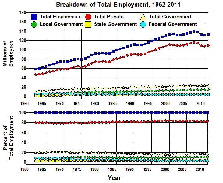
Figure 1 provides a breakdown of Total Employment in terms of Total Private and Total Government employment with a further breakdown by kind of government: Local Government, State Government, and Federal Government.
Figure 1
As is shown in this figure, as Total Employment went from 58.5 million in 1962 to 139.0 million in 2007 and then fell to 133.0 million in 2011 Total Private employment went from 46.7 million to 115.4 million in 2007 and then fell to 109.4 million in 2011.
What is most significant about this figure, however, is it shows virtually no change in the ratio of public sector to private sector employment over the forty-five year period from 1960-2011 and that government employment as a fraction of Total Employment actually fell by 2.5 percentage points (12.2%) during that period.
Government Employment
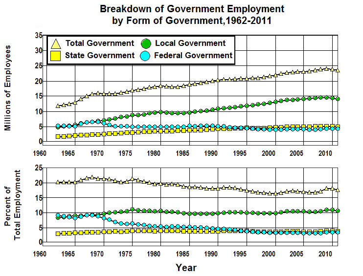
Figure 2 expands the bottom of Figure 1 to provide a clearer picture of the trends in government employment from 1962 through 2011.
Figure 2
Here we can clearly see the downward trend in Total Government employment as a fraction of Total Employment. We can also clearly see the reason for that downward trend, namely, the 16% decrease in total number of Federal Government employees that led to a 63% decrease in the ratio of Federal Government to Total Employment.
Federal Government Employment
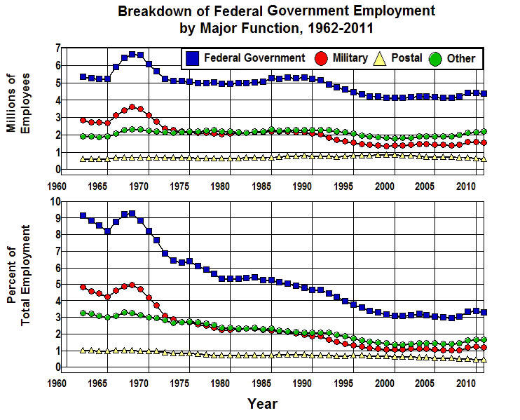
Figure 3 breaks down Federal Government employment by Military, Postal, and all Other federal employees.
Figure 3
Here we can see that while there was a slight increase in Postal employees in 2011 over 1962 and Other federal employees increased by 20%, these increases were more than offset by the 16% decrease in Military employees. In addition, all categories of federal employment failed to increase as rapidly as Total Employment in the economy during this period which led to 5.7 percentage point (47%) decrease in Federal Government employment as a percent of Total Employment.
State Government Employment
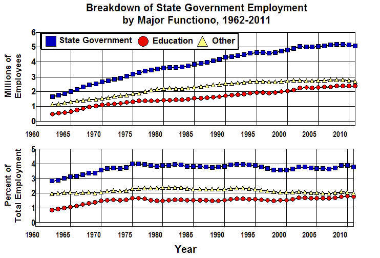
Figure 4 provides a breakdown of State Government employment in terms of those employed in Education and all Other state employees.
Figure 4
Here we find that while the number of State Government employees increased from 1962 through 2011, it only increased faster than Total Employment through 1975, and the number of State Government employees as a fraction of Total Employment was slightly less in 2011 than it was in 1975. It is also worth noting that almost all (90%) of the 33.7% increase in State Government employment as a fraction of Total Employment that took place prior to 1975 was brought about through an increase in Education. The fraction of Total Employment attributable to an increase in Other state employees remained relatively constant throughout the entire period, increasing by only 2.6%.
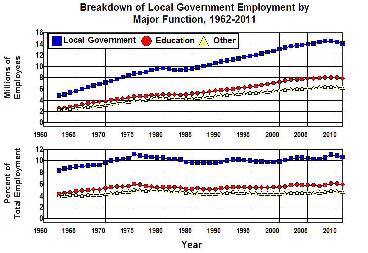
Local Government Employment
Figure 5 provides a breakdown of Local Government employment in terms of those employed in Education and all Other individuals employed by states.
Figure 5
Here we find a pattern that follows that of State Government employment—a gradual increase in Local Government employees throughout the period with and increase in the State Government to Total Employment ratio through 1975 and a leveling off of this ratio after 1975. As with State Government, the 27.4% increase in this ratio since 1962 was driven mostly (76%) by an increase in Education.
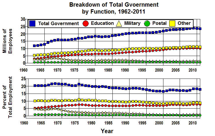
Summary of Government Employment
Figure 6 provides a summary of Government Employment broken down by Education, Military, Postal, and all Other individuals that work for the federal, state, and local governments.
Figure 6
Here we find that while the number of government employees has increased substantially in all of these categories except Military, the only category that has kept pace with the increase in Total Employment is Education.
What this means is that the number of soldiers, police officers, firefighters, IRS and ATF agents, Border Patrol and TSA officers, CIA agents, judges and courthouse personnel, public defenders, prosecutors and attorneys general, corrections officers, park rangers, postal employees, public health workers, food and building inspectors, foreign service and Environmental Protection Agency employees, emergency medical technicians, county road commission and county clerk employees, agricultural extension service employees, those who man our water and sewage treatment facilities, and those who administer the Social Security, Medicare, Medicaid, Veterans Administration systems along with those who administer the National Institute of Health, Center for Disease Control, unemployment and worker's compensation programs, our public assistance programs, and all of the other government agencies and programs that we rely on to make our lives and communities better—the public servants who make up the heart and soul of the government bureaucracies right-wing ideologues incessantly rant against as having grown totally out of control—have actually failed to keep up with the increase in Total Employment that has occurred in the real world as our economy and population have grown since 1962.
Employment Tables
Excel workbook that contains the data and calculations used to construct the above graphs.